[I didn’t know there were so many rules that could be broken!]
How is art created? What decision was made that forced an action? Was it intuitive or planned? Or even an accident? Do I do the same? Can I learn from it? So when the wonderful Winslow Art Centre posted they were offering a class with Mark Daniel Nelson “52 art rules and how to break them” my curiosity was piqued.
Only a week in and it hasn’t disappointed. With a topic ‘Landscapes must have depth – discuss’ , I am intrigued about what I feel about that statement. Instinctively I agree. Of course! Everyone knows landscapes are all about recreating a sense of depth, using colour and tone to give an impression of distance. But if I challenge myself on art that I love and view it alongside other works of art to try to understand why it doesn’t speak to me in the same way then I get a different answer.
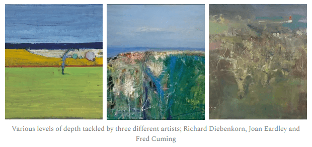
I love all three of these paintings by wonderful artists but for very different reasons. Their interpretations of distance and depth of what is a similar motif of fields, sea and sky has been tackled in very different ways and as a result they speak to me in a variety of emotions.

Diebenkorn ‘Untitled (Invented landscape) 1966” is the flattest with his use of similar thickness of marks and use of rich colours from top to bottom but still our brains can interpret the fact that the dark blue rectangle is the sea and it must be further away from the field just because our memories tell us that is so. I feel joy and childhood camping when I look at this one.
Fred Cuming’s “The Harbour, Watchet” has the greatest depth; the red line (lighthouse?) in the sea is being battered by waves crashing against its rocks but you just know its at least a good three hour walk to get to the edge of that cliff closest to the lighthouse. The pale marks of the shrubs in the foreground give us the most detail in contrast to the paler, larger masses in the background. As with all of Fred’s work, it is ethereal and dreamy; my deep thought emotion.
The middle painting “Summer grasses and Barley on the Clifftop” by Joan Eardley speaks most to me and I think most reflects my own painterly handwriting. The complexity of the foreground is exciting and contrasts with the pale flastness of the sky and sea behind it. Joan wanted us to fall in love with the cliff and all the nature exploding within it. Distance is merely a tool to draw attention to the noise and celebration of the foreground.
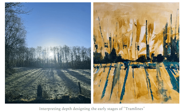
As I work on my next artwork inspired from a beautiful frosty walk along the old quarry Tramlines last weekend, I will keep the question in my mind ‘does all landscape have to have depth?’.

